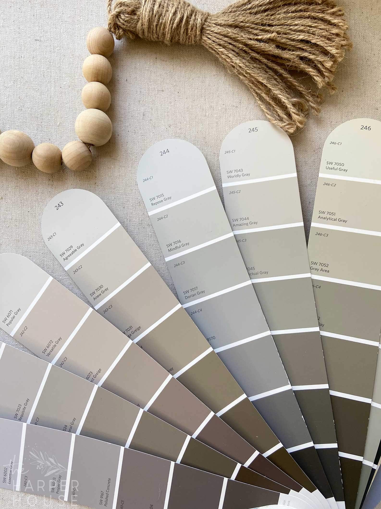
Repose Gray SW 7015 The Ultimate Guide
So, you're thinking about Repose Gray. Everyone is. It’s like the Kardashian of paint colors. Ubiquitous. But is it *actually* good? Let’s dive deep into the Sherwin-Williams SW 7015 phenomenon.
Repose Gray. You see it everywhere. Instagram, Pinterest, your neighbor’s living room. This seemingly innocuous greige has taken the design world by storm. But what's the big deal? Is it just another trendy neutral destined to fade faster than your millennial pink accent wall? Or is there something more to this whisper-soft hue?
Sherwin-Williams SW 7015 Repose Gray is, to put it simply, a gray with warm undertones. It's not quite gray, not quite beige. It’s… greige. This nuanced shade walks a fine line, managing to be both calming and sophisticated. It’s the chameleon of the paint world, adapting to different lighting conditions and design styles.
The allure of Repose Gray lies in its versatility. It can play the role of a subtle backdrop or a statement-making feature, depending on how you style it. Pair it with crisp white trim for a classic look, or go bold with contrasting dark accents. The possibilities are seemingly endless.
This chameleon-like quality also presents its biggest challenge: undertones. Depending on the light, Repose Gray can appear more gray, more beige, or even slightly green. Understanding how light affects this color is crucial to achieving the desired look in your space.
The precise origins of Repose Gray within the Sherwin-Williams color library are shrouded in corporate mystery, but its rise to prominence is undeniably linked to the growing popularity of greige as a go-to neutral. It offers a welcome alternative to stark white or beige, providing a sense of warmth and sophistication. A key issue with Repose Gray is its tendency to look different in various lighting conditions. This makes careful consideration of your room's natural and artificial light essential.
For example, in a north-facing room, Repose Gray may appear more gray and cool, while in a south-facing room, it may appear warmer and more beige. Testing the color in your specific space is crucial.
Benefits of using Repose Gray include its versatility, allowing it to complement various design styles. It also creates a calming atmosphere and increases the perceived value of a home due to its popularity. For instance, a living room painted in Repose Gray can easily transition from a minimalist aesthetic with white furniture to a bohemian vibe with colorful textiles.
To successfully implement Repose Gray, start by sampling the color in your room. Consider the lighting and existing décor. Prime your walls before painting for a consistent finish.
Advantages and Disadvantages of Repose Gray
| Advantages | Disadvantages |
|---|---|
| Versatile and works with various styles | Can appear different under various lighting conditions |
| Creates a calming and sophisticated atmosphere | May require multiple coats for even coverage |
| Increases perceived home value | Can feel too neutral for some tastes |
Best Practices: 1. Sample the color. 2. Prime your walls. 3. Use quality paint. 4. Consider the lighting. 5. Consult with a professional if needed.
Real Examples: 1. Living room with white trim. 2. Bedroom with dark accents. 3. Kitchen with wood cabinets. 4. Bathroom with marble countertops. 5. Home office with metallic accents.
Challenges and Solutions: 1. Undertones appearing too green - Solution: Adjust lighting or use a warmer white trim. 2. Paint looking patchy - Solution: Prime walls and use quality paint. 3. Color looking too cool - Solution: Incorporate warm-toned décor. 4. Color looking too flat - Solution: Add contrasting accents. 5. Difficult to coordinate with other colors - Solution: Consult a color specialist.
FAQ: 1. What undertones does Repose Gray have? Warm gray, often appearing slightly beige or greige. 2. Is Repose Gray a good choice for a bedroom? Yes, its calming nature makes it suitable for bedrooms. 3. What trim color goes well with Repose Gray? White, especially warmer whites. 4. Does Repose Gray look good with wood floors? Yes, it complements various wood tones. 5. Is Repose Gray a cool or warm color? It's generally considered a warm gray. 6. What is the LRV of Repose Gray? 58. 7. Is Repose Gray good for exteriors? Yes. 8. What are some similar colors to Repose Gray? Agreeable Gray, Mindful Gray.
Tips and Tricks: Use warm lighting to enhance the beige undertones. Use cool lighting to emphasize the gray undertones. Pair with natural textures for a balanced look.
In conclusion, Sherwin-Williams Repose Gray SW 7015 offers a versatile and sophisticated neutral for any space. Its ability to adapt to different lighting and design styles makes it a popular choice for homeowners and designers alike. While the undertones can be tricky, understanding how light affects the color is key to achieving the desired outcome. By following best practices and considering the tips and tricks mentioned, you can harness the power of Repose Gray to transform your home into a haven of style and tranquility. Remember to always test the color in your specific space before committing. The potential for creating a truly remarkable space with this adaptable hue is vast. So, go forth and embrace the greige!
Downloadable pdf cover pages transform your documents
Unearthing the secrets of a tree without roots manhwa
Unraveling the fifa womens world cup tournament rankings


